What are the different types of graphs? What kind of graph do you use? How do you present data using graphs and tables? These questions may seem tough to answer, which is why I have come up with several pointers for you on how you can use different types of graphs effectively.
Below are the different types of graphs and when you should use them.
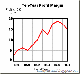
Simple line graph. A simple line graph is very effective in depicting changes in data over a certain period of time.
Comparative line graph. This kind of graph, as its name implies, helps compare different values over a certain period of time. For instance, comparing the salary increase of four companies in the past ten years can be shown effectively through a comparative line graph.
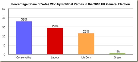
Bar Graph. A bar graph has more versatility in showing comparisons. You can group data together and compare groups of data, instead of comparing data one at a time.
The bars in a graph can be shown either horizontally or vertically. If the text you have to use to describe the bars seem to take up too much space, horizontal bars will help solve the problem.
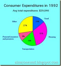
Pie charts. Also known as pie graphs, these help your readers visualize percentages.
Now that you are familiar with the different types of graphs and what they best portray, visit back in a few days for more information on how to use different types of graphs to make your presentation more effective and professional.


0 comments:
Post a Comment