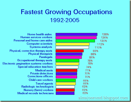
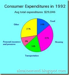
If you are wondering how to use graphs effectively in slide shows, papers, and other presentations, you have to ask yourself, “What message do I want to give my readers?” However, that is only the tip of the iceberg. Making a presentation both professional and effective means knowing the basic tenets of making graphs.
- A graph should be used only to make a certain point. For instance, if you want to show how revenues have increased by 300 percent, or if you want to show how more than 75 percent of people answered yes in a survey, then graphs can serve as visual props. However, do not use graphs excessively; use them only if you want to make sure that your audience will remember an important statistic or idea.

- Your graph should always have a caption. Captions prepare your readers as to what they information they are about to process.
- Make sure that sources are properly attributed. This gives your graph authority, making it a reliable visual aid.
- Graphs should be easy to understand. If a graph takes too much effort to digest, then it is not doing its job – and you are better off deleting it from your presentation. An effective graph should be self-explanatory, needing no added explanation from you. All you need to do during a presentation is give additional details to help give the graph more meat.
- Your graph should follow equal spacing. If the space from 20 to 30 is twice as big as the space between 30 and 40, then your graph will be very confusing. The spaces between indicators in an axis should be proportionate to the values they represent.
It’s easy to use graphs effectively. Learn about the different types of graphs (pie charts, line graphs, etc.) and what they are best used for here.
